COVID-19 is one of those events that will likely not just define the way people will interact with each other, but likely entire socieities. I wouldn't even be surprised to see this pop up in an AP US History textbook in a decade just for how long the pandemic has been drawn out for. So it should be no surprise that from the first month of the pandemic, a vaccine was the only thing on people's minds. I mean, just look at this graph depicting the number of total coronavirus cases in the U.S. alone.
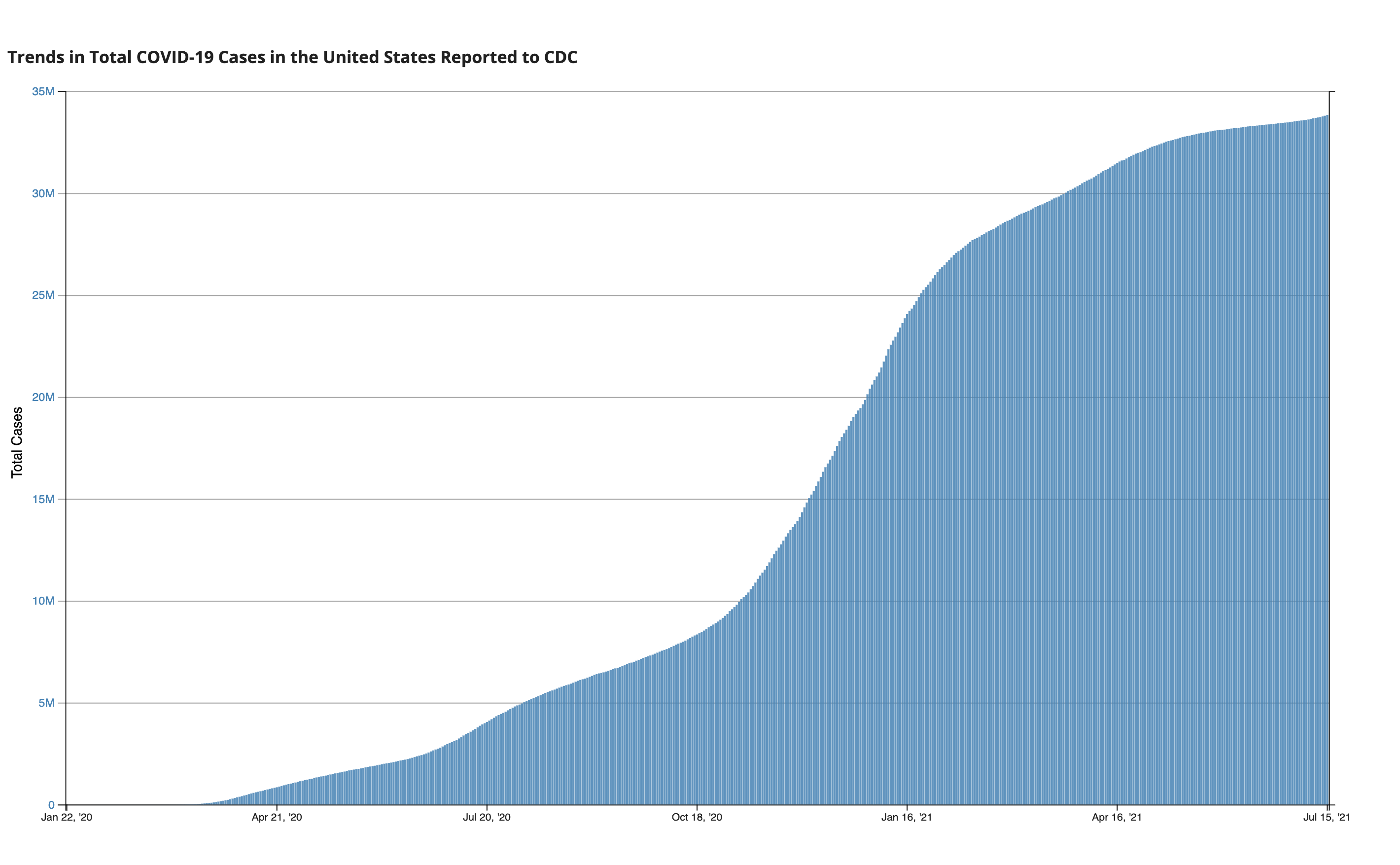
Data as reported by the CDC (updated as of July 15th)
It took around 2 months to hit a million cases in the U.S., and another 3 months to reach 5 million cases. That's the issue with pandemics: they explode at a rate faster than we can realize. So, today, I want to talk a little bit about different types of disease models, and how these can educate ourselves on the right preventative courses of action.
The SIR Model 2 Ways
The Susceptible Infected Recovered Model of disease spread groups individuals into 3 boxes and relates them to show how each box grows or diminishes over time: susceptible means that you are currently healthy but are vulnerable to the infection; infected means just that and indicates a current illness; and while recovered doesn't necessarily mean you overcame the disease, it means you are unable to spread the disease anymore (sobeit proper recovery and developed immunity, but also the unfortunate case if you die since both are no longer disease vectors). This sounds like the perfect use for a Markov chain (here's a refresher if you need one)! Our Markov chain will have 3 states being the aforementioned susceptible, infected, and recovered, and will follow a transition model as such:
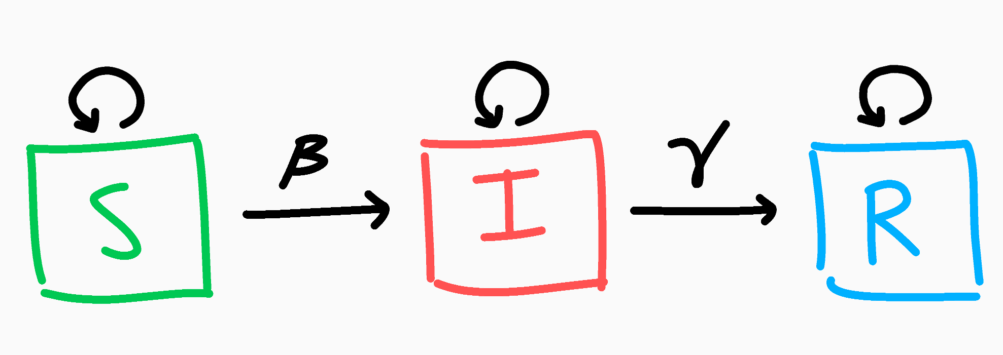
The SIR Markov chain model
Let's say everyone starts out as susceptible; we can write our initial population as $N$, and the initial distribution of those $N$ people as $P = \begin{bmatrix} N & 0 & 0 \end{bmatrix}$ for $N$ susceptible, 0 infected, and 0 recovered.
With that out of the way, let's think about the above Markov chain. If you are currently susceptible, each day there's a chance you might become infected. Let's call this probability $\beta$ as the average chance of getting infected. At the same time though, if you are smart and act carefully, you might not become infected, and this will be $1-\beta$. Similarly if you're infected, there's a chance you might (positively or otherwise) overcome the disease! We'll call this probability $\gamma$, and the chance of not recovering $1-\gamma$ (you can think of $\gamma$ by taking its inverse: $\frac{1}{\gamma}$ is the average number of days for a recovery to occur). Finally, if you're recovered, that's the end of your journey, as once recovered you're always recovered. This can be condensed into the simple transition matrix below.
With that, let's run a trial with infectivity $\beta=.4$ and $\gamma=\frac{1}{5}$ (we expect an infection to take 5 days to recover). So on Day 0, everyone is healthy and (ironically) susceptible to our disease. The following Day 1, people are interacting and enjoying themselves, unbeknown to them that they are spreading a new contagion. Day 1 results in $PM = \begin{bmatrix} 800 & 200 & 0 \end{bmatrix}$, which makes sense as we expected 20% to become infected. We can track each state of S, I, and R and plot them accordingly across the span of a month.
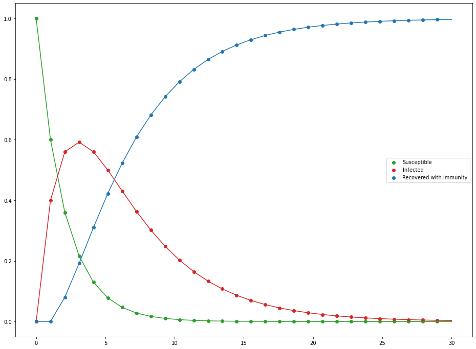
Evolution of the SIR Markov chain as percent of the population
For such a simple model, it's not bad, but there are some obvious flaws. For starters, the infected population doesn't really infect others; all infections stem from random appearances in the susceptible population. This is why by the end of the 30 days, we have 0 susceptible and only recovered, since infections don't require infected to be present which is kind of odd (notice how our initial population was only susceptible and yet infected pop up). We can do better.
While Markov chains were appealing due to the nature of having 3 states, what we really want to focus on is the relationships between the 3 states: if there are lots of infected people, that should increase the rate at which others get infected. Since we're looking at how the value of one box (infected people) affect the rate at which the other boxes change (how fast susceptible and recovery decrease/increase), perhaps we should try a system of differential equations. Instead of states, we'll now have 3 different functions: $S(t)$, $I(t)$, and $R(t)$, which returns the number of susceptible, infected, and recovered at a time $t$. If you're not familiar with differential equations, don't worry, this section will be brief. The idea behind differential equations is that sometimes it's hard to exactly quantify a function or value, but we know how the function changes relative to another value. See the first few minutes of this video if this idea intrigues you and for some nice opening examples. Besides, you already know more or less what the equations look like we know what the function should look like.
That's really all there is to them. The specific math behind it looks more complicated than it is, but keeping the above in mind will make it much clearer.
I like to think of it that of that the fraction of the vulnerable people $\frac{S}{N}$ have a $\beta$ chance of being infected, which is scaled up by the number of infected people $I$. That makes sense for number of new infected people. Similarly, if the average chance of recovery is $\gamma$, then you should expected a proportion of $\gamma$ infected people to recover ($\gamma I$). Last important fact to note is what happens when we add these equations together:
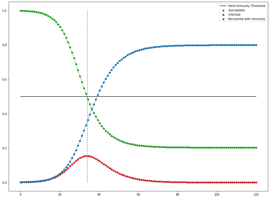
No matter how the 3 different categories of people evolve over time, the net change between all of them will be 0, meaning our total population remains the same over time (which is good since we don't want people appearing and disappearing out of nowhere). Let's watch the scenario unfold once more with $N=1000$ with a distribution of $P = \begin{bmatrix} 999 & 1 & 0 \end{bmatrix}$ (someone has to start the pandemic), $\beta=.4$, and $\gamma=\frac{1}{5}$.
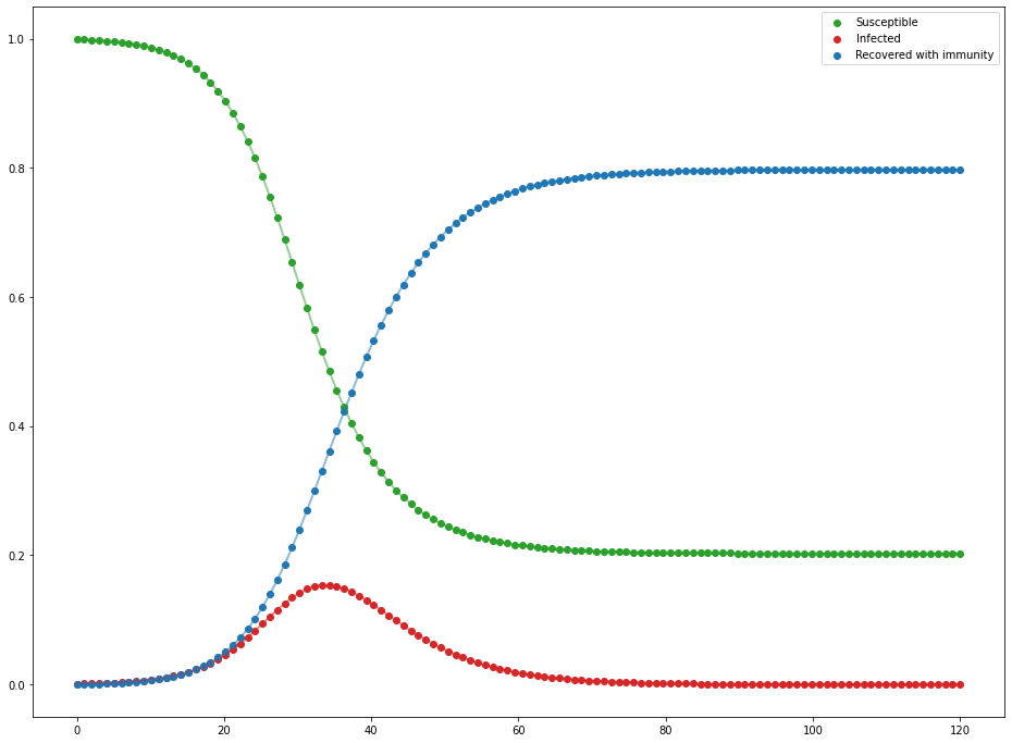
Evolution of the SIR differential equations as percent of the population
That's more like that famous curve. It may not be as drastic as the 10 day everyone-is-infected model as the Markov chain we tried earlier, but it's definitely much more realistic. A single person was able to infect about 800 people across only a couple of months, which is still scary fast.
$R$ and Disease Containment
Just as famous as a curve this may be, you likely have heard of the idea of $R$ and $R_0$ too. $R$ is the reproduction number of a disease/virus that tells you on average, how many people an infected person will spread the disease to. If $R>1$, then you get the epidemic issue, where the disease is spreading exponentially as each person is giving more people than just themselves the disease. When $R=1$, you have an endemic where the disease is neither spreading nor being contained. When $R<1$, then you have a contained virus that is decaying throughout a community. $R_0$ is just the $R$ value at the start of the outbreak, and can be found with the formula $R = \frac{\beta}{\gamma}$. In our simulation, $R_0 = \frac{.4}{.2} = 2$. So if we wanted to contain this disease, we want to find how many infections we need to contain for $R<1$. Since $R_0 \cdot .5 = 1$, we only need to contain 50% of infections to contain the outbreak!
You can see as soon as there is less than 50% of the population left to infect, infections start to decline—not end, but decline. You can also reduce infectivity by wearing preventative measures (i.e. masks) or getting the appropriate immunization against the disease (i.e. vaccines). If you want to read more about this model and more of its intricacies, Nicky Case wrote a very nice interactive article about it.
Small Scale Vaccinations and Graph Theory
While we did find a nice model to represent disease spread, the SIR model only is really nice for analyzing very big communities. With the SIR model, we assume everyone interacts with enough people so that infected people can always target a susceptible person if they need to in this very dense network of people.
Most people, though, only regularly interact and really care about those immediately in their social circles. In this small scale, such as say, a neighborhood or even a friend group, people do not interact with others equally. Some are more introverted and interact with only a few people, and some are extroverted beacons that interact with most of the group. This changes the dynamics of disease spread a lot as obviously those who are more outgoing and meet more people will be more at risk of being infected than someone who only talks to a few people. As such, we'll need a different approach than the SIR model.
In order to model connections between people we'll use a graph. A graph in this case is not the standard parabola of $f(x) = x^2$, but rather it is a visual tool consisting of two parts: there are nodes which are dots (to represent people here), and edges that are lines that connect nodes (to represent interactions or friendships).
.png)
Example of a graph that may represent the individual friendships in a clique
As in most groups, we have a couple of people at the center connected to quite a few people, and some on the edge of the circle regularly interacting with as few as 2 people. This is a really helpful representation as now not only can we watch where the virus spreads, but we also have a direct way to implement small scale prevention tactics as we can see specifically who is infected. Ideally, we would vaccinate everyone in this group and make sure (consequential) disease spread can occur, but that might not happen. So, if we could only vaccinate, say, 25% of this group, who would you vaccinate to minimize a disease vector? There are some obvious candidates such as the nodes with the most connections, but what is the best way Let's leave our susceptible people in green and infected in red, but we'll add a new purple node to indicate vaccinated.
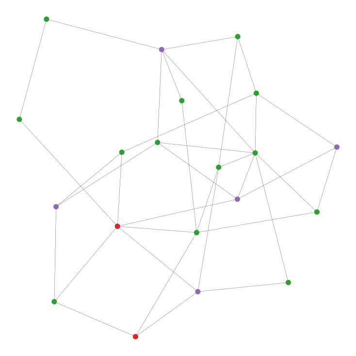
Randomly vaccinating 5 of the 20 people in the network. Can we do better?
Before we talk strategies, let's be clear about some of the assumptions made for simplicity sake.
- Vaccinations are 100% effective both ways, completely negating the possibility of infection of and transmission from the vaccinated person as if fully immune.
- Edge lengths do not matter; if someone is connected to another person, we assume that that edge will act the exact same way as all other interactions and edges. This ensures a contant $\beta$.
- Dying and recovering from the disease will be again treated the same under an overarching "Recovered" state, in which the affected person becomes fully immune.
- An infected person "recovers" after only a single day ($\gamma = 1$) since a) it will ensure our simulation can spit out some numbers at the end as it's hard to completely protect an entire network of people, and b) our program wasn't written the most efficiently.
As before, we want to find strategies ways to reduce $R_0$. But, what is $R_0$ in this case? Well, remember $R_0$ is just the average number of transmissions a single infected person will instigate. So, we can approximate this with the average number of edges an infected node has, multiplied by the infectivity. Since we can't change the infectivity rate ($\beta$), the only way we can lower it is by removing possible edges for infected people to transmit across. So, let's look at different strategies that are both really good and really bad at removing edges from our graph.
- Random: Realistically, vaccinating people randomly seems like a bad idea. In a simulation, though, it's never a bad starting point.
- Random then neighbors: Here, we start with a single random person to vaccinate, then only vaccinate people connected to an already vaccinated person. If your friend got vaccinated, why shouldn't you?
- Most connected: This is the obvious solution. If we want to reduce edges efficiently, why don't we vaccinate the nodes with the most edges connected to the most people?
- Most connected non-neighbors: This is a spin on the last one. We want to vaccinate the most connected people, but why not spread them out a bit? We pick the highest connected node to vaccinate, and then proceed to vaccinate the next highest node that is not connected to a vaccinated person.
- Least connected: This one is more of a why not scenario. It's like the previous two strategies but reversed: find the loners of the group and vaccinate them.
Again, we'll randomly vaccinate $\approx$25% of our population (50/100, 100/200, 200/400, and 400/800 people/total connections) according to our strategies above. We'll also infect 10% of our population with the contagion of your choosing with the same infectivity at $\beta = .4$ as before. We'll do 10 trials per population size, and average them to get a rough estimate at how each strategy faired.
.png)
Unsurprisingly, vacciating the most connected nodes without restriction faired the best; closing off as many routes of infection as fast as possible led to only about 10% of non-vaccinated people getting infected. Following close behind is most connected non-neighbors strategy. Even though we tried spreading out vaccinations since the edge between two vaccinated people doesn't require two does of the same vaccine, by nature of being a popular node, it is likely connected to other popular nodes too. So in reality, we are removing fewer edges than we could be just vaccinating the most popular nodes. It's for this reason why our orange strategy of randomly vaccinating one person then its neighbors was such a bad strategy: not only do we not know if we're vaccinating a well connected person, but we're wasting vaccines but doubly protecting edges between neighbors. Since reducing the edge count is our only form of reducing $R_0$, this is a very bad strategy. What is surprising though, is that vaccinating the least connected people was almost as good as random. Since unpopular people can only be connected to so many people, they tend to be pretty spread out removing a fair number of edges between all the vaccinated people.
What next?
Honestly, our graph model isn't all that bad considering how simple it is, but let's look at some nice upgrades we can hand over to it.
Graph Generation
This was originally made as a school project, so we generated our graph by taking some number of edges and placing them randomly between nodes for simplicity in presentation. However, these obviously aren't the only types of networks. A prominent one for modelling interactions between people is the Erdös-Rényi graph. For $n$ nodes, there are $n \choose 2$ possible pairings of nodes for edges. In an ER graph, we flip a weighted coin to accept an individual edge, and the final result is just the collection of edges we added. If our acceptance probability is $p$, then we would expect the graph to have a total of ${n \choose 2}p$ edges, each node to have on average $p(n-1)$ connections. In this network, people are approximately as popular as others (since our coin flip method leads to a binomial distribution with few super popular or super unpopular people).
.png)
An Erdös-Rényi graph with an average connection of 4.8. Look how nice and even this graph is.
Another type of graph is the Barabási-Albert type graph. The idea with this network is that people tend to be connected to a distinct, central "hub" of a few people that make up most of a network. The idea is that you start with a small network of $m$ people/nodes to begin with. At each step, you add a new node and connect it to another person $i$ with probability $p_i = \frac{E(i)}{\sum_jE(j)}$ where $E(x)$ is the number of edges for node $x$ and $j$ represents all other nodes. The idea is that if $E(i)$ is really big (i.e. a super popular person), then you'll have a much bigger probability to connect to that person over someone who only has a few connections. Wouldn't you want to hang out with the cool kids too? You can give $i$ as many connections as you want, so long as it's less than $m$ (think about the first new node: how can someone have 10 different friends in a group of 5?).
.png)
A Barabási-Albert graph where each new node gets 2 connections to the existing network. Can you see the clusters of the graph?
If you want to explore this more, the inspiring article that led to this project analyzes these 2 exact graphs in the exact problem we discussed above, going a bit more in depth with the idea of the counterintuitive friendship paradox.
New Vaccination Schemes
We looked at a very specific set of vaccination parameters, namely relying on all edges are treated equally and that the number of edges a node has is constant. In reality, people don't interact with each other equally, so instead of having a generic edge, we could implement an edge weighting. This quality would add a number between 0 and 1 to each edge to represent how "friendly" two people are with each other. We could then simulate the difference between best friends and mere colleagues interacting that may have more or less of a chance to spread a virus. The other aspect to consider was updating edge counts. Ideally we would only want to count a vaccine's candidate's number of edges to vulnerable people, not vaccinated onr infected people too, with counts updating after every vaccination. Then we could focus on protecting people specifically.
The final problem I wanted to talk about what the goal of vaccines are in a network. As we said, it's about removing edges efficiently, but some edges are definitely worth more than others. Imagine you have two friend circles, with exactly one mutual person between them. Even if that mutual friend has only two edges, vaccinating him would close that bridge between the two friend circles, isolating the virus into only one of them.
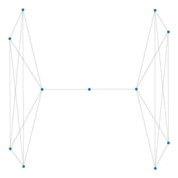
Vaccinating the literal middle-man isolates the two groups
This searching for a way to split our graph in two parts with the fewest number of edges removed is called the sparsest cut problem. If we can find the (usually approximate) sparsest cut, we can divide our graph in two and attempt to isolate the virus in only a singular bubble. Before, we were looking to remove something known as Hamiltonian paths, where you can't connect any one node to another. Here, we are trying to isolate the virus into a smaller bubble.
.png)
Sparsest cut of a random ER graph that approximately cuts the graph in half
So here we would want to vaccinate everyone on the border of the yellow-purple divide to make the sparsest cut a reality. Of course, this only works if you have enough vaccines AND if your sparsest cut splits the graph in half evenly. This strategy can be used recursively on the two sub-graphs, so the more vaccines you have, the better this strategy works.
Conclusion
I hope this brought some light to the epidemic math that goes on behind the scenes of so many news articles, but more importantly showed you the power of modelling situations not just in different ways, but creative ones as well. Graph theory in particular has such widespread applications, often just thinking of something simply with connections can allow you to borrow from its variety of tools and techniques.